Podcast
Swisspreneur
570+ podcast episodes turned into instant, cited answers
Read the case studyAt Streaver we build fast. Much faster than two years ago, because AI writes most of the code and on several projects the client writes code too.
That changes what I do. Most projects today don't allow taking days for full research, wireframes, defining a design system, producing final designs and iterating on constant changes. It's not that any of that is wrong, but the product keeps moving while you do it.
What I can do is define the base the AI builds on.
You see it in almost every AI-built product on the market today, and it might just be part of the new reality. The problem is when those interfaces hurt the user experience: unnecessary text, low contrast, text sizes nobody can read, navigation that makes no sense, criteria that contradict each other from one screen to the next.
 Example from impeccable.style/slop, which catalogues the patterns AI reaches for by default.
It's not that AI designs badly, it just has nothing to compare against. Every new screen comes out a little different because every time it picks again: another grey, another size, another modal hand-built instead of the one that already exists.
On projects moving fast, where things change constantly, rules that hold the product together are essential.
The client is a golf booking platform with two surfaces: a web app course staff uses all day, and a portal where golfers book their tee times.
The goal was to write the product's design rules down in one place, so that any AI creating a new screen follows them instead of inventing patterns that make the experience worse.
Before deciding anything I asked the AI for a report on the code. Count, don't touch.
Some of the things that came back:
That last one is the one that mattered most. Skills someone downloaded at some point, left installed, and the AI uses interchangeably with no criteria for deciding which one to follow.
Three decisions shaped everything else.
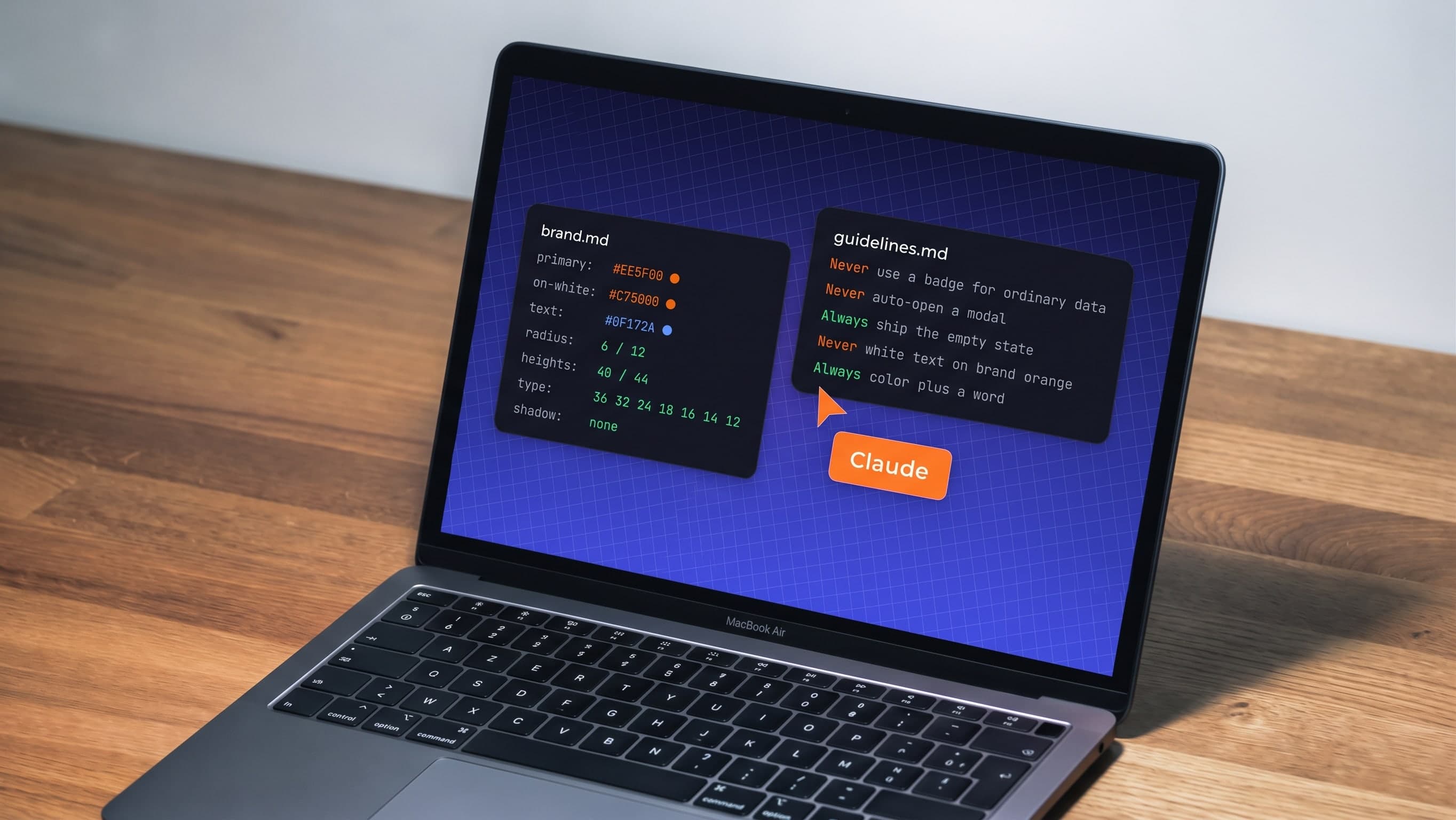
The output was two files in the repo: one with the UX guidelines and one with the branding.
The guidelines one is a collection of UX best practices I pulled from different sources, put together for this product and filtered through my own criteria as a designer. The point was not to end up with one more guidelines document like the thousands online, full of rules an AI made up.
The branding one is written in DESIGN.md format, an open format from Google Labs for describing a design system to AI tools. It has two layers: the values up top as data, and prose below explaining when to use each one.
As for the design skills that had already been added to the project: some I deleted, some I pulled valuable information from, and others I kept because they complemented my documents. If an old document stayed around saying the opposite, the AI would follow whichever it read last.
A document the AI reads is a strong suggestion; it doesn't necessarily work as a rule. What holds it up is four levels, from weakest to strongest: the documents, the tokens, an automated check, and someone looking at the screen.
Tokens are stronger than the document. They work as a tool; if the right value exists under the right name, the AI uses it without reading anything.
For the automated part I built two things.
A check that compares the code against the branding document. If someone adds a style or value that isn't declared there, it fails.
A weekly report that only looks at what was written that week. It arrives on Mondays with two numbers: how many new values don't match and the comparison against the previous week. Below that, each finding comes with the value that doesn't match and a short explanation of why, where to see it, and the PR it came from. It has only just started running, so there's no trend to show yet.
This last step gave back the most. I asked the AI for a new screen, without reminding it of any rule and about something that didn't exist in the product, so it wouldn't copy from another screen.
It came out pretty well, but not perfect. A few things came out wrong, for different reasons:
Here's a before and after of the Events page. Same information but following the rules that were written down.
 Original screen
 Version following the new docs
What changed:
I went in thinking the product needed more rules. It turned out it needed fewer, and ones that didn't contradict each other.
It's worth testing, more than once. Asking for a screen and watching what the AI makes up is the most honest feedback a document can get. Every time it guesses, it's showing you exactly where you haven't been clear yet.
This is only one part of how we work at Streaver, and it isn't a recipe. Nothing about working with AI is settled yet, and that's part of what makes it fun. The best thing you can do is try things, see what breaks, and find the way that works for you and your team.
570+ podcast episodes turned into instant, cited answers
Read the case study
Building a $1M product for $125K with a non-technical CEO at the keyboard
Read the case study
First paying enterprise customers in fourteen weeks
Read the case study
How a developer automated his daily planning with a scheduled AI agent: no code, just a document, a schedule and one prompt. Rules, examples and costs.

Devin will sell you an AI software engineer. Nobody mentions that you also just became its engineering manager. An honest comparison of buying the AI tool vs. renting the outcome — and which deal your company actually needs.

We moved our dev-workspace setup off manual steps and onto two scripts our tooling runs on create and archive. The deciding factor wasn't the time saved; it was that disposable, collision-proof workspaces are the only thing that survives multiple coding agents working in parallel.
Streaver embeds senior product teams inside companies building AI-native software, from whiteboard to live customers.
Talk to us